
Hometown Pharmacy
Brand IdentityMarketing
Print-
2025
Challenge
Hometown Pharmacy needed a visual identity that felt approachable, trustworthy, and connected to the local community.
Goal
The goal of this rebrand was to create a more approachable and engaging visual identity that reflects Hometown Pharmacy's commitment to personalized, community-focused care.
The updated identity was designed to strengthen the customer experience across both physical and digital touchpoints, with branded takeaways, social media content, and a customer rewards program extending the brand beyond the pharmacy environment.
Assets

Old Logo

Updated Logo
Social Media posts
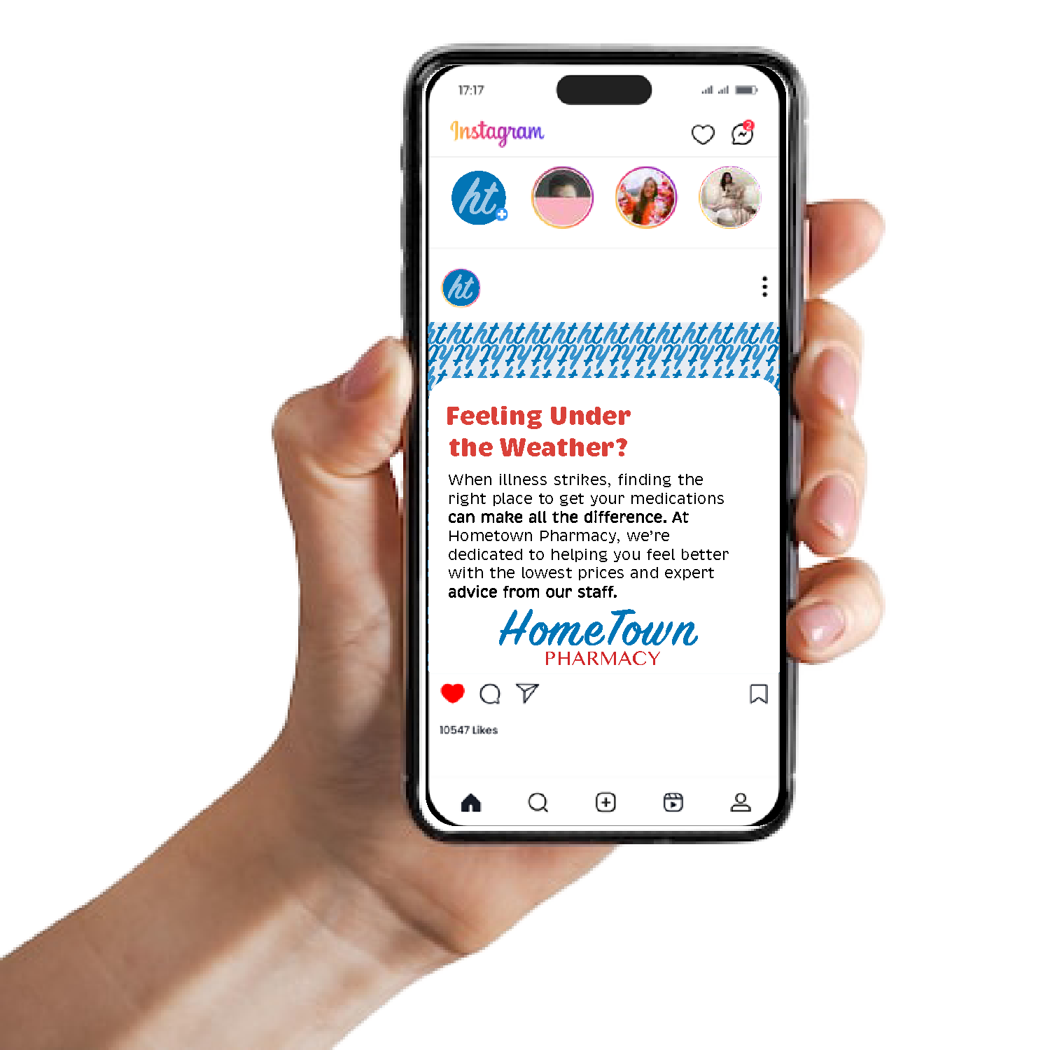
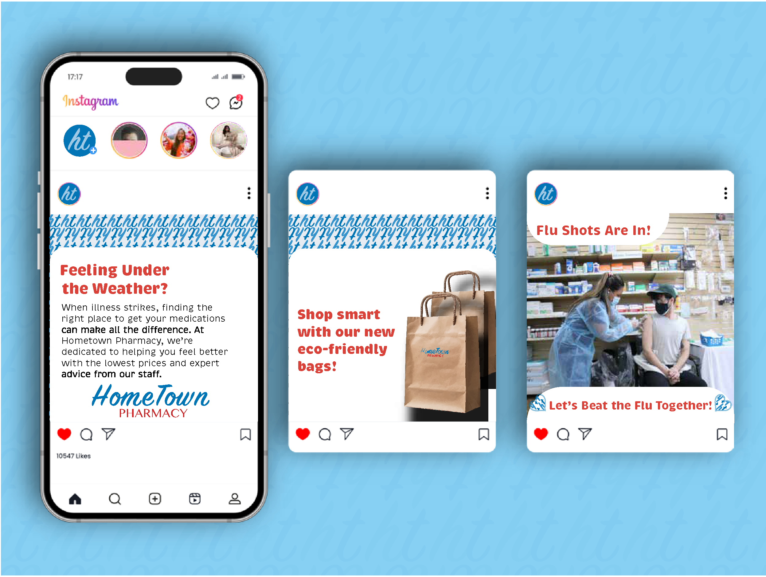
To connect with a younger audience and extend the updated identity into digital spaces, I developed a series of social media templates focused on approachable health information, pharmacy services, and community engagement.
Physical takeaways
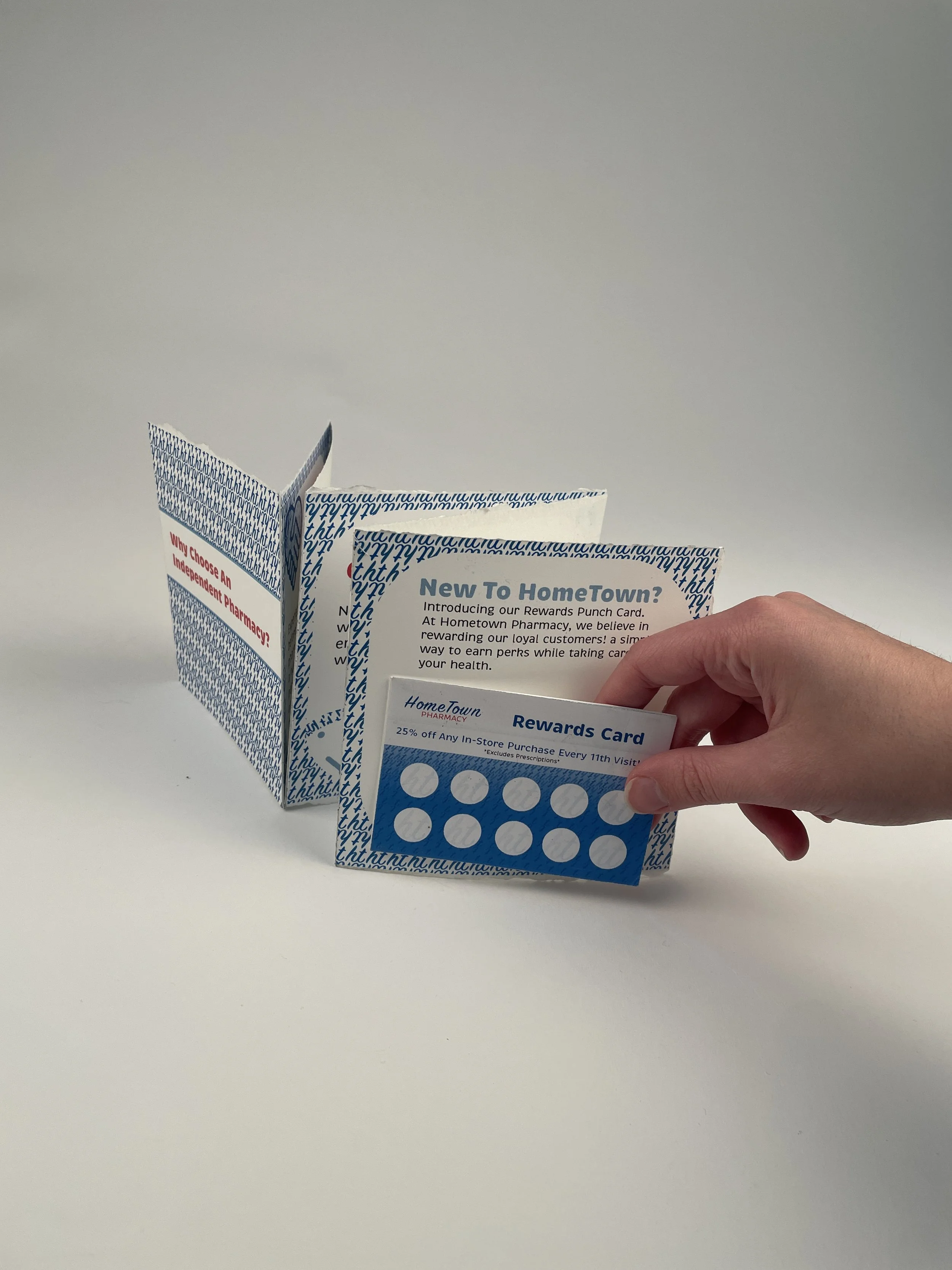
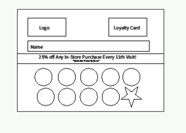
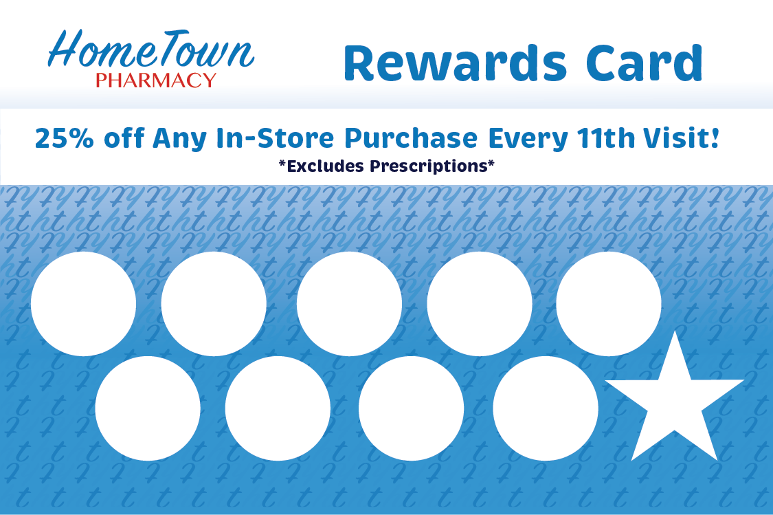
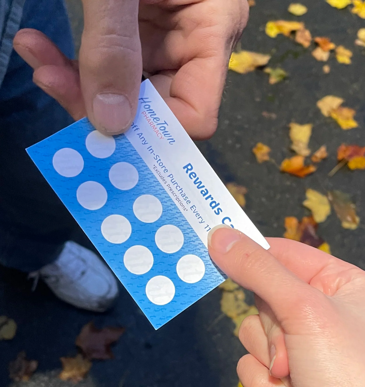
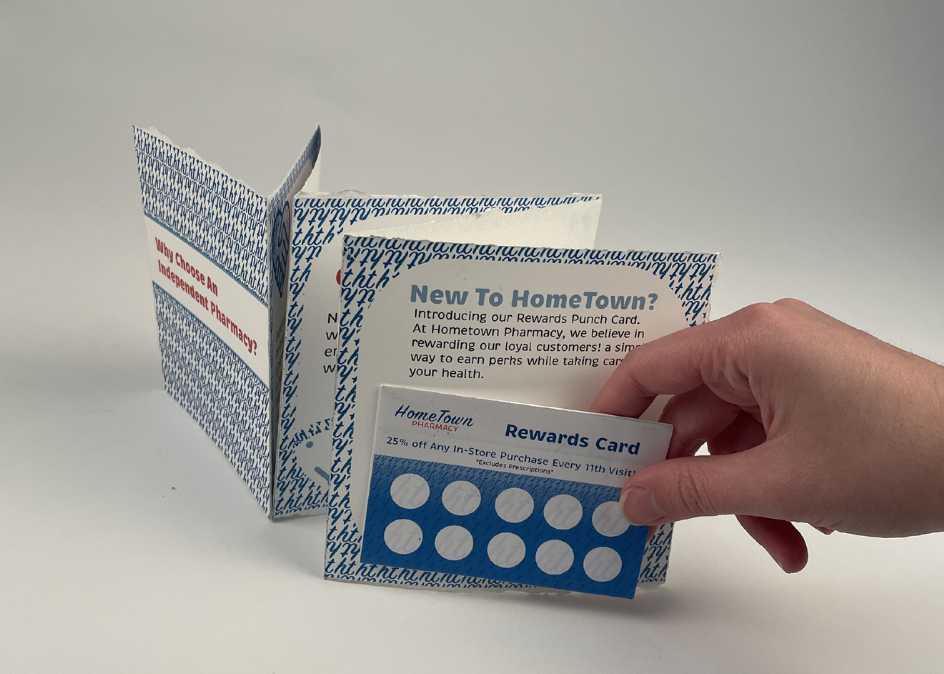
Designing a rewards card offers a chance for customers to gain loyalty for a business, while giving an incentive to want to return. The punch card is designed so that for every 11th visit, customers will receive 25% off an In-store purchase, excluding prescriptions.
Rewards Card
Initial Sketch
Final Design
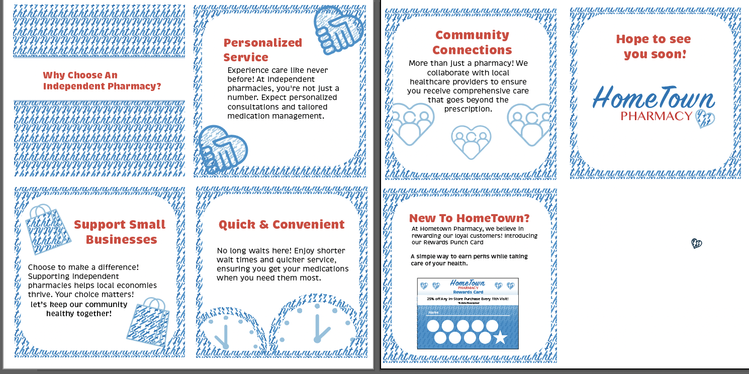
The pamphlet was designed as a tangible customer touchpoint, providing customers with key information while creating a convenient, physical takeaway. The back of the pamphlet incorporates a designated space for the rewards card, keeping both pieces together and making the rewards program easily accessible for continued engagement.
Pamphlet
Outcome
The rebrand creates a more approachable and cohesive visual identity for Hometown Pharmacy while extending the brand across physical and digital customer experiences. The resulting system provides a flexible foundation for future marketing materials, social content, and in-store communications.