Nourish & Conserve
Educational Campaign- 2025
Objective
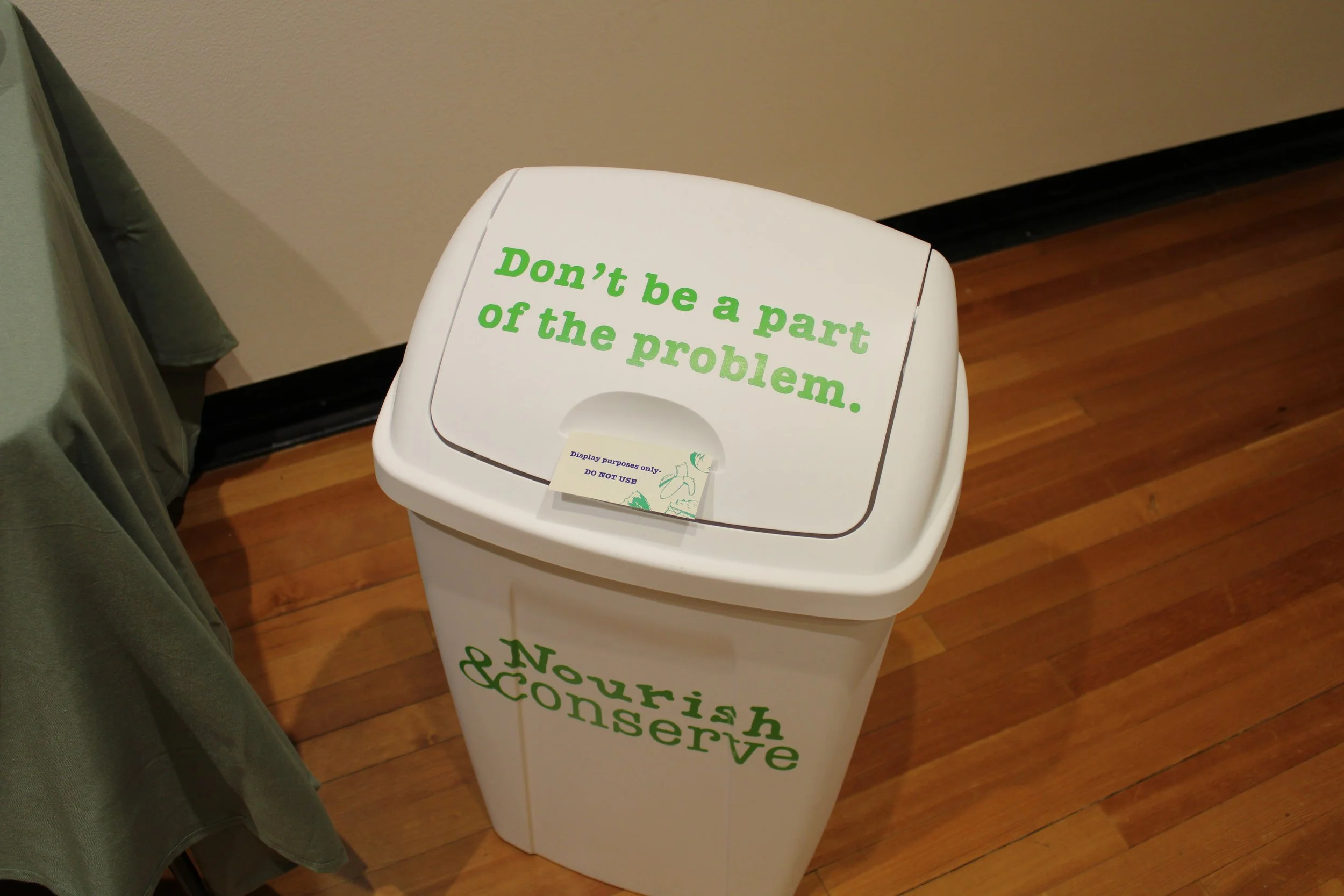
Nourish & Conserve is a multi-platform educational campaign aimed at raising awareness about food waste among college students. The campaign combines a user-friendly website with actionable waste-reduction tips, informative print materials, and environmental graphics applied to a trash can featuring a prominent call to action. Together, these touchpoints encourage students to make more conscious decisions about food consumption and disposal.
Description
To raise awareness of food waste among college students and encourage more sustainable consumption habits through an engaging educational campaign. By providing practical resources, clear messaging, and strategic visual touchpoints, Nourish & Conserve aims to help students better understand the environmental and economic impacts of food waste while empowering them to reduce waste in their daily lives.
The Process
The first step was to research topics of interest. Once I decided on going with food waste, I researched problem areas and overall food waste just to get more insight.
Research
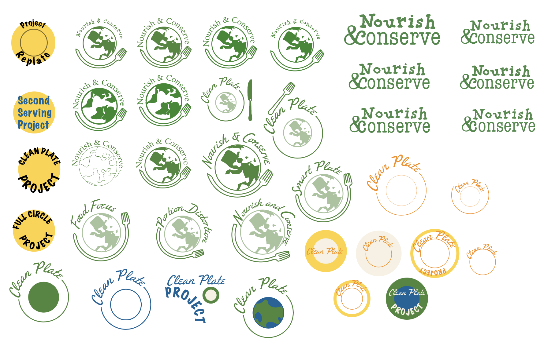
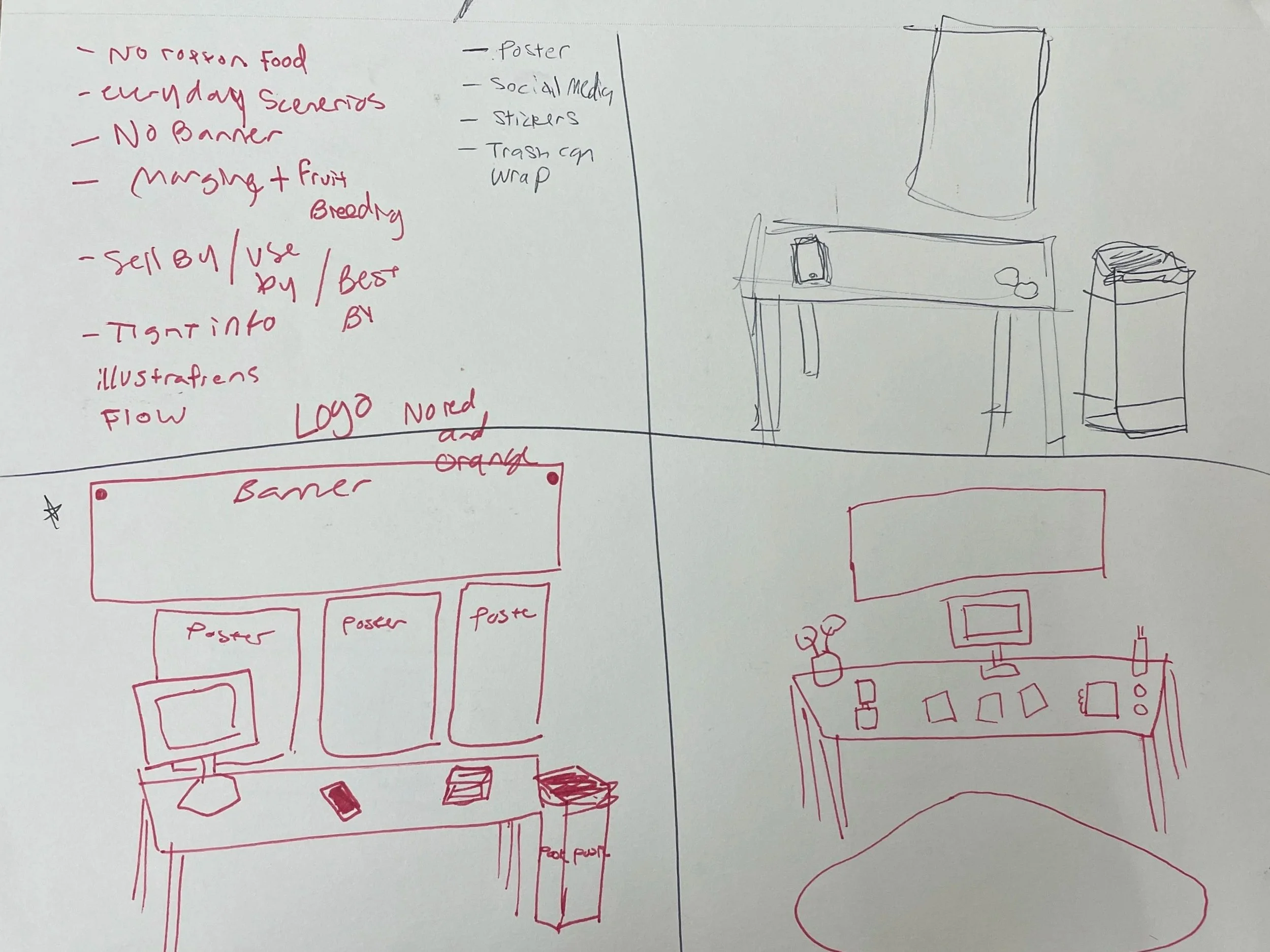
Now that all of my research has been done, I now went into preliminary sketches on how the setup would look and digital renderings of the physical assets. Along with the research, I created logo iterations and name exploration for the campaign.
Proposal
After researching and sketching, I created a proposal for the direction of the brand

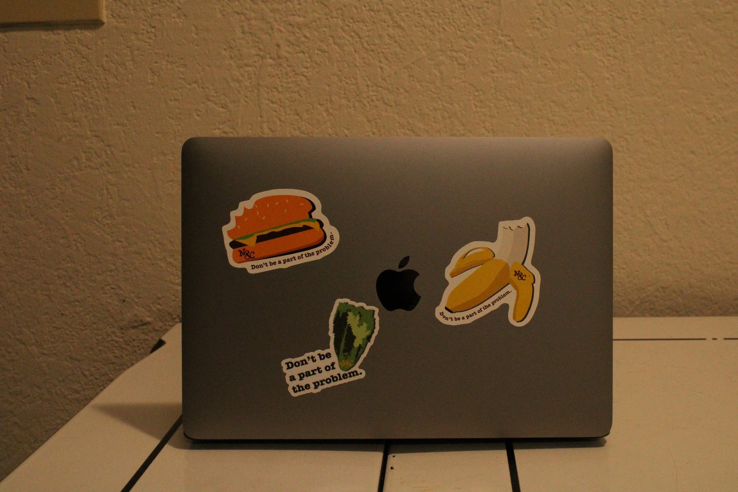
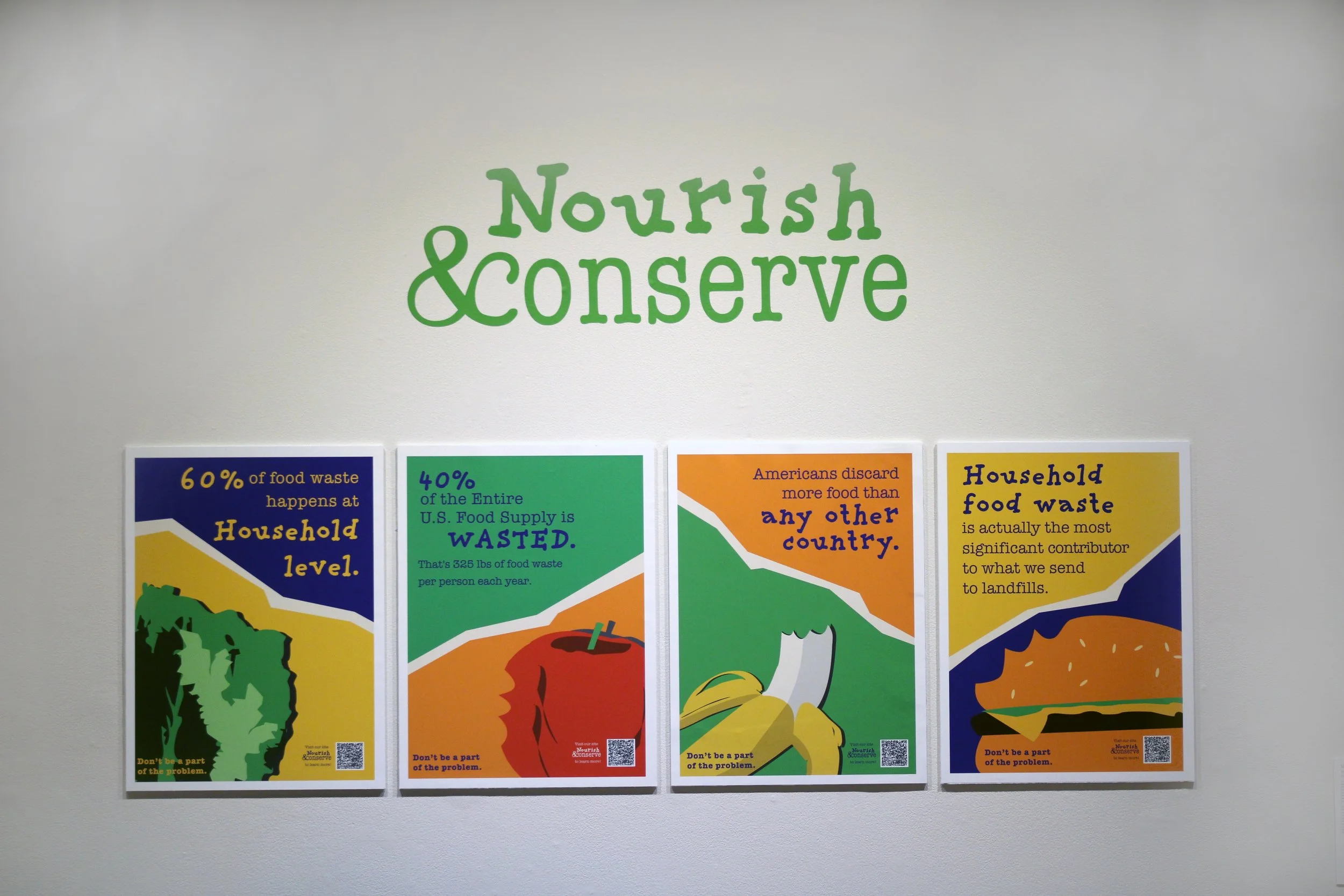
I wanted to make the CTA very straight to the point. That is why I went with Don’t be a part of the problem. It is simple and gets the point across. The CTA was put on the final deliverables, including the stickers and the posters near the logo.
Call to Action
Sticker Design
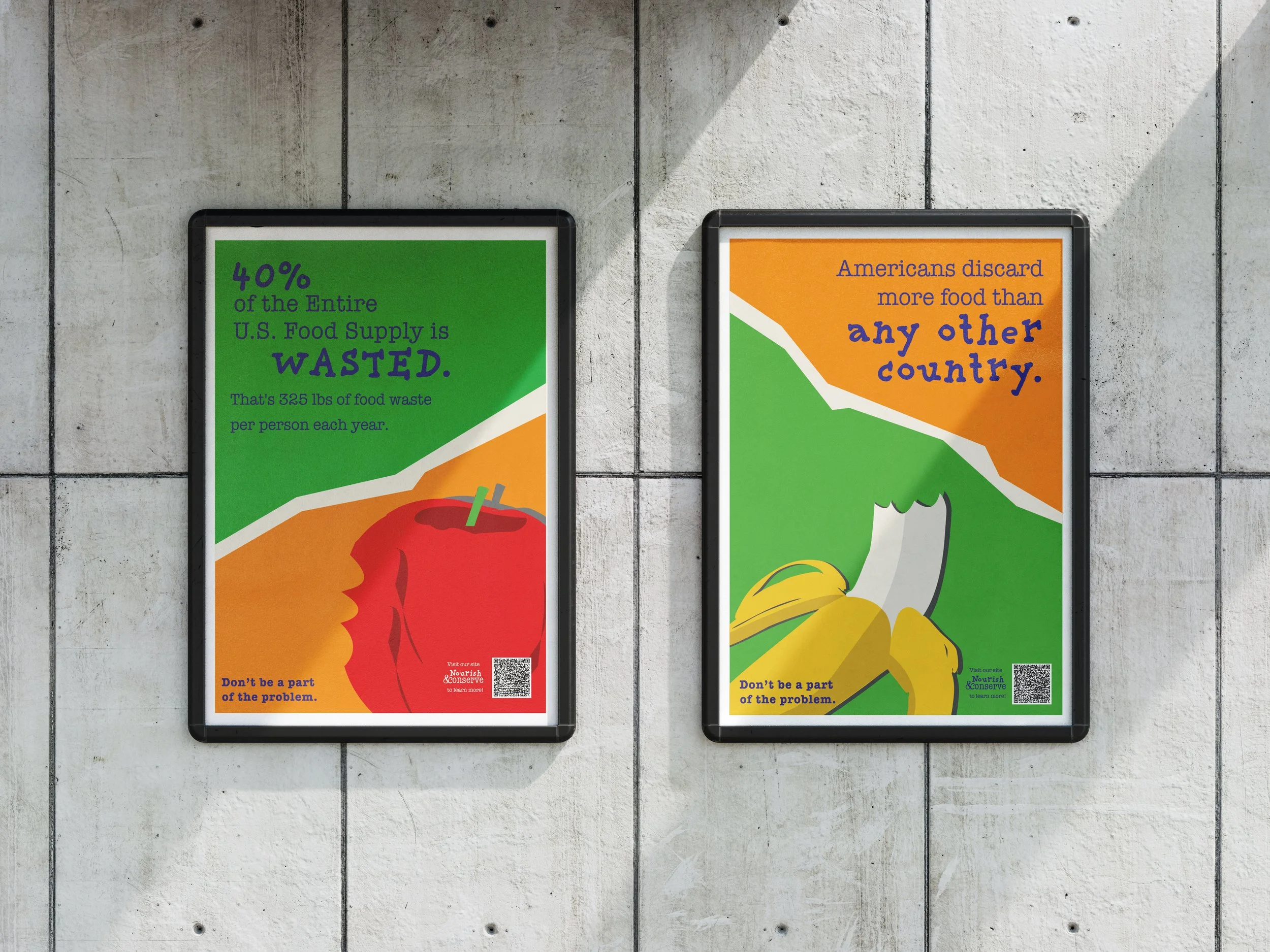

Posters with CTA

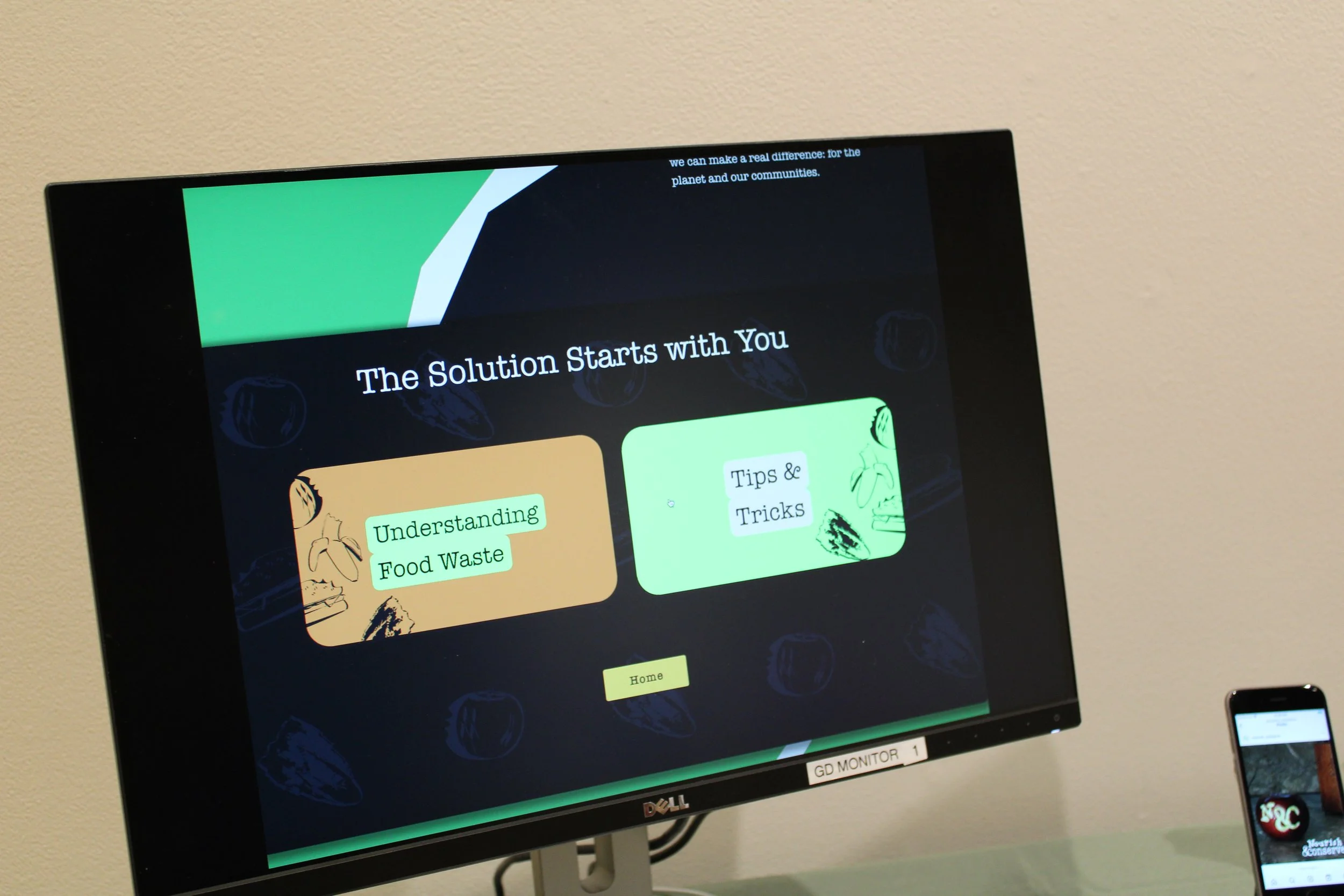
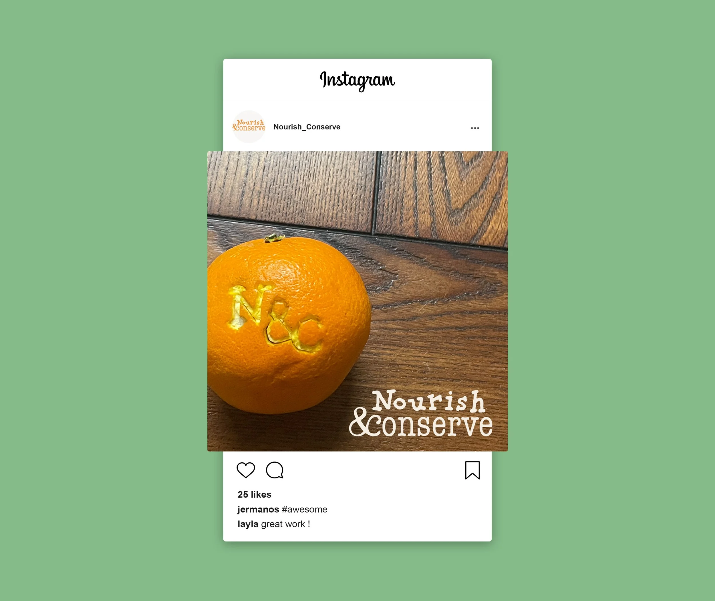

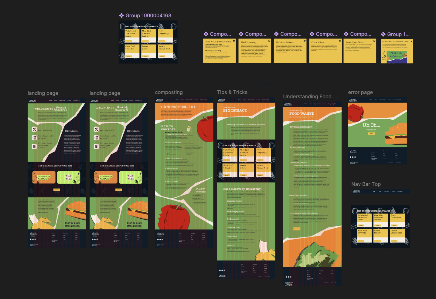
I also thought about the digital presence of the campaign. Social medial and a website were created to help spread and grow Nourish & Conserve.
Digital Interfaces
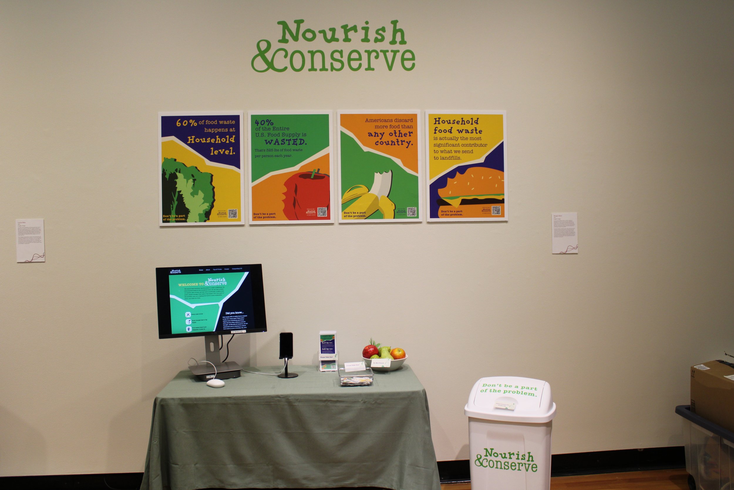
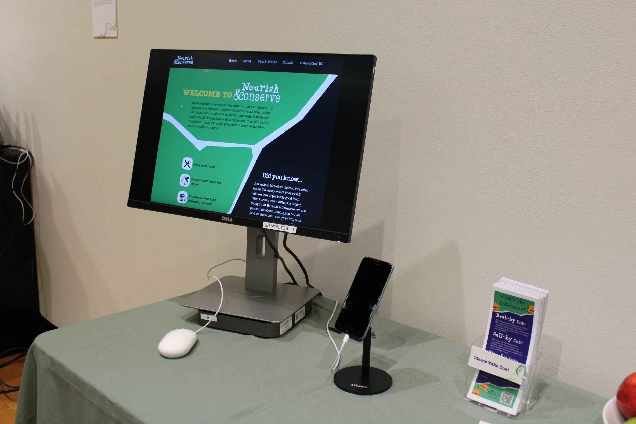
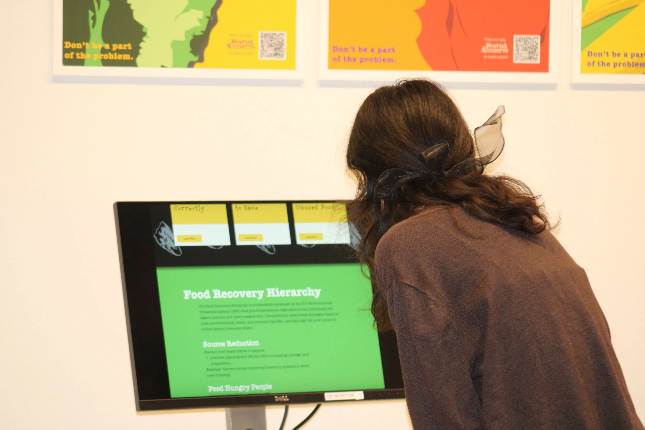
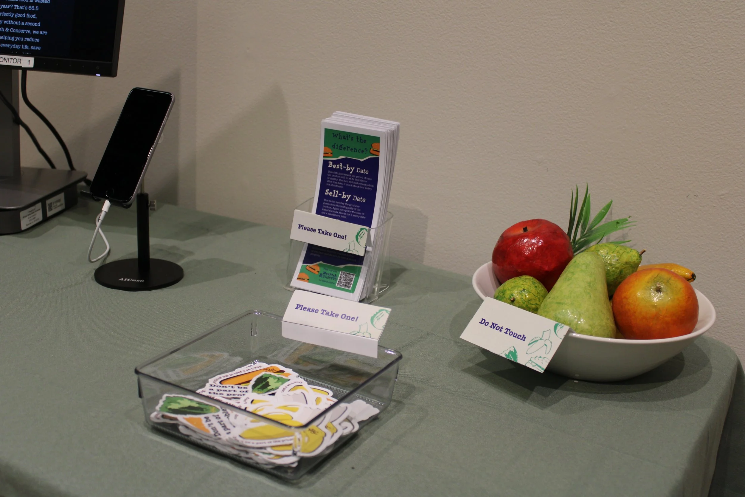
During the final exhibition, there was the final versions of posters, flyers, stickers, and a display of the trashcan with the CTA. Along with physical assets, there was a phone and computer showcasing digital interfaces. The website was on the computer while the phone displayed Nourish & Conserve’s instagram.
Outcome